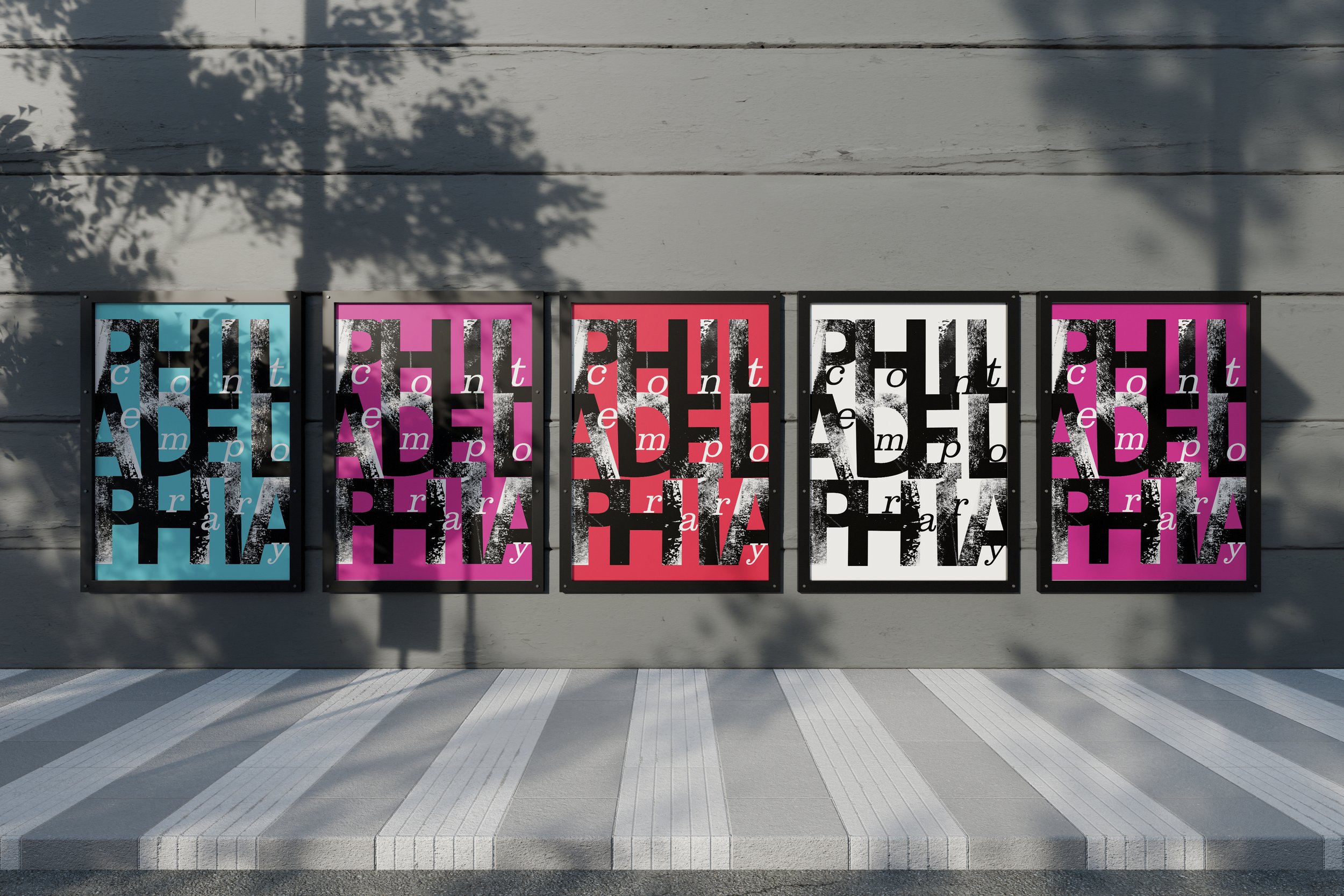
philadelphia contemporary
This is a brand redesign project that I completed for my branding course, as well as my motion graphics course. Philadelphia Contemporary is a small artist collective based in Philadelphia, that offers a community for artists and art lovers to gather and participate in events and exhibitions. For this redesign, I wanted to create a brand system that was simple and concise, but also raw and artistically driven. My process included collaging, ink printing, and image editing. The logo consists of a square type lockup with ink texture, and serif type letters dancing around the word “Philadelphia.” I went through several iterations of the logo in order to simplify it and streamline it for use across many different forms of media.
FINAL LOGOS
alternative LOGOS
instagram post advertisement
When I designed the posters for this project, I concluded that the design elements I chose would work well in motion rather than as static elements. Building off of the textures used in the logo, I designed 2 short animations with multiple different textures in motion, as well as adding motion typographically. These two dynamic animations are built for an instagram post format.
Poster Designs
I created a 3-part poster series for various upcoming events at Philadelphia Contemporary. The posters mimic the essence of the logo, utilizing gridded vertical type. The posters each use the same grid system, and include a strip of color to highlight the logo placed at the bottom. Through editing and recoloring the images, I was able to preserve a specific color palette for each poster, creating a tonal balance that is visually appealing.


